(Ansel Adams)
The contrast was what struck me first, giving the landscape a stark quality that sets off the pure power of the water and the sharp stillness of the stone. The tree and the waterfall, at opposite vertical third lines, counterbalance each other nicely.

(Ansel Adams)
Typically I think of wood as dark against its background, which gives this image its power over me, since it is bright and white and looks like bone over the gray. There are no distracting elements in the top two-thirds of the photograph, allowing the branch to be the center of the focus.

(Ansel Adams)
Here as well the trees are lighter than their background; the young sapling makes a perfect subject because it is glowing in the light and looks as though it is aflame. The repeating lines of the other tree trunks in the other two thirds of the photo keep the tree from appearing lost.

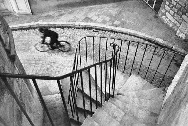
(Henri Cartier Bresson)
The bicyclist is a third away from the top left corner of the frame; this heightens the feeling that he is racing out of sight, and that he was caught in a moment of escape.

(Willy Ronis)
These nuns appear submissive and sedate, since they are overshadowed by trees that stretch two-thirds of the frame higher than them. The difference between the soft earthiness of the grass and flowers beneath them and the heavenly light of the sky above them provides an interesting contrast.
No comments:
Post a Comment