Monday, May 23, 2011

Portrait Critique


I am pleased with the movement of the image and the tilt of the frame, and I think that the blurred background fits well with the scene; however, I wish that I had either focused on both girls or only one, and I wish that the image was slightly sharper (although that is difficult to achieve) and had higher contrast. I would like to try taking more portrait photos in situations where there is both stillness and action. I'm glad that I attempted to work with this photograph, but I think I could do a better job of capturing the feeling of excitement and enthusiasm that was clear to me at the time when I took the pictures.

Portraits

http://artmundus.files.wordpress.com/2010/05/mccurry-steve.jpg
(Steve McCurry)

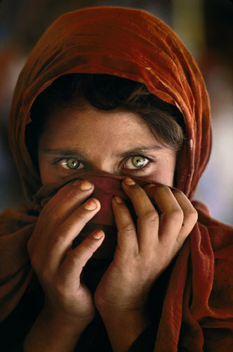
1. This portrait practically leapt off the screen when I first saw it because of the eyes. Those eyes are so intense, almost cold and hostile, and so hard. They are eyes that have seen more than any child should have to see.

http://cdn.theatlantic.com/static/coma/images/issues/200711/steve-mccurry.jpg
 (Steve McCurry)

2. I love this portrait of the man before the tree because it appears as though the entire earth is tilted, but the man is holding himself perfectly straight and balanced.

https://blogger.googleusercontent.com/img/b/R29vZ2xl/AVvXsEheT5JMlqpUCDmTp2HmsL8-_r_n4ocxWdWLwumo3z0s3qP26sKxTgI53_52vk9X_LXAANSCXcJomSclc5WmOavX3_awyV-2TPNwz0tnrwwO0ICDlLPkfp9ZqZoo5AaD_jnKH_0QEOGuL11d/
(Henri Cartier Bresson)

3. The tension in this black and white silhouette style photograph is especially sharp because the man's book is about to break the glassy, perfect surface of the water. I like that his reflection is clearer than his actual form.

https://blogger.googleusercontent.com/img/b/R29vZ2xl/AVvXsEjX_F4IhTMvbcsCZdy25xUecMQJPdNzh5DP9pL6r1-wf6-kjZoxWhzQRM2iyMyugyUJsZ2npPLCJl7jjwKwG8JAVeLeq5X5b6QxFrsqzYyI-AGfNZJNJy1YC0EI2s8Tnho5Dqn9aPC4fTBP/s1600/HenriCartierBresson_flag.jpg
(Henri Cartier Bresson)

4. I like the way the woman's clothes and movements blend with the flowing flag - this photograph makes use of the powerful presence of lines. I also think her expression is intriguing.

http://www.mac-on-campus.com/Portals/0/History_Criticism_and_Commentary/National_Geographic_Coakley_image_Abell.jpg
(Sam Abell)

5. I think that this portrait has an element of mystery and surprise in it; I love the way the light glowing behind him makes him shadowy and imposing. The fishing net draped from his hands adds character as well.


http://www.mackcustomleather.com/images/Sam-Abell-002.jpg
(Sam Abell)

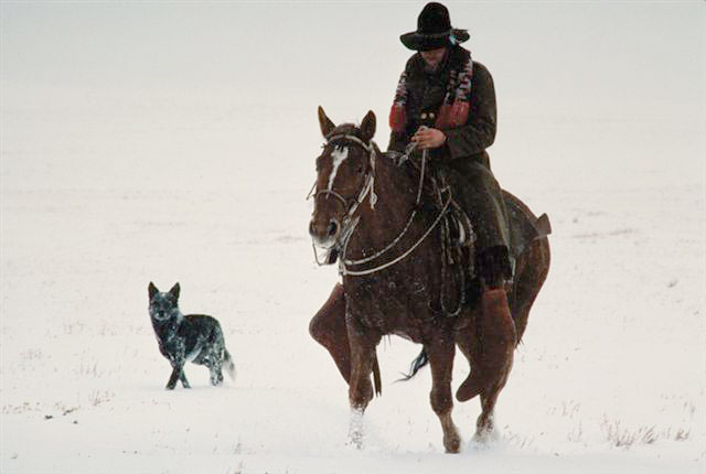
6. In some ways, I think the hidden face conveys a more powerful message than an open, visible one. The blending colors of the clothes, the content countenance of the horse, and the bright, curious expression on the dog's face help express emotions that are not necessarily derived directly from the man.


http://images.nationalgeographic.com/wpf/media-live/photos/000/040/cache/scott-sroka-text_4076_600x450.jpg
(Scott Sroka)

7. Everything about this photograph is mingled surprise and beauty. Here is a girl bathed in pretty golden light in front of a colorful fading landscape, shoes abandoned at her side, and in her hands a phone. It startles me that the soft expression on her face is directed at the tiny electronic device that seems so unreal compared to her surroundings.


http://static.guim.co.uk/sys-images/Travel/Pix/pictures/2006/03/20/p10caribbean360.jpg
(Catherine Karnow)

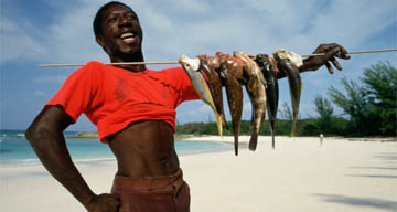
8. I like this photograph because it tells the man's story; it shows his pride, his skill, and his happiness, and it reminds me that life can mean so many different things to people in different places around the world.

Photo: Whirling dervish
(Reza)

9. This swirl of red movement is like a pretty flower or a bright painting - it is simply pleasing to look at, and it looks so vivid and real. I like the intensity and the simplicity, as well as the feeling of concentration that it evokes.

http://asmp.org/culture/bestof2008/Aaland/BruceDale_DSC3232.jpg
(Bruce Dale)

10. I like portraits that focus on multiple people, and this one in particular has incredible dynamics. The triangle they form speaks volumes about their possible relationships and emotions - the boy off in the background might be racing back to join the group, or splashing off to explore on his own. And I admire that the shot caught the girl frozen in mid-flip.

Dramatic Lighting

1) Use side lighting (to the right or the left of the face) instead of flat lighting (like the sun or a well-lit room)

2) When the subject is posed against a large dark background, there are certain steps one must take to ensure that the exposure is correct (the light meter on the camera gives a false reading because it averages the amount of light from the entire picture). First, one must take a light meter reading for the entire scene from exactly where it will be photographed. Then one should change the shutterspeed to underexpose by one to two stops (this means that the shutterspeed will be faster).

3) The closer one is to the source of the light, the more dramatic it will appear.

4) When up close to a subject's face, if one half is light and the other is in shadow, the light meter reading should be taken for the side of the face that is brighter.

What Makes a Great Portrait?

I think it is important to have a simple background that doesn't distract the viewer from the subject, but rather compliments it in color, contrast, and focus. The angle of the photograph is another essential element of a portrait, and I think it is absolutely necessary to make sure that the angle is compatible with the emotion or expression that the person portrays (for example, looking down on someone to show their innocence). I think movement or purpose is critical in giving meaning to a portrait - or if not movement, some occupation that makes the person appear engaged in activity (like a girl holding dishes or flowers in her hands). If this isn't applicable, sometimes the background can play a greater role in adding detail and significance to a portrait photograph, like the rubble of a developing country behind a little boy or the vastness of an open space behind a praying woman. But I think that overall, the most important thing to remember about a portrait is that it should convey a message about the person or people it captures on film. It should attempt to provide a glimpse of the story of their life.

Sunday, May 22, 2011

The Photographers

Five useful ideas and themes I found in the DVD:

1) Patience - In certain circumstances, it can be useful to take multiple photographs of the same thing from slightly different angles or with slightly different settings. Sometimes you have to sacrifice many photos in order to achieve one spectacular shot (like the photoshoot with Jane Goodall).

2) Persistence - Sometimes the best photographs come out of impossible difficult, uncomfortable, dangerous, or painful situations. The example that comes to mind is the scene where Nick Nichols was taking photos in the rainforest and the flies were swarming in his face.

3) Layering - One of the things I've noticed about National Geographic photographs is that they almost always have depth and layering. They're never flat, even if they're simple. They give the impression of three dimensional space. This often seems to be accomplished by having multiple horizons (like a field, a mountain, and a cloud bank, one after another).

4) Focusing on eyes - The most powerful part of the face is undeniably the eyes, and if you can capture the emotion within them, you can change your entire photograph. My favorite illustration of this principle is the image of the hooded Afghan girl by Steve McCurry.

5) Choosing subjects that have feeling - Every photograph I saw in that movie had a story or a meaning to it that I could instinctively feel in just one glance. I think that a photographer has to choose subjects that give him or her that feeling of awe or inspiration that Henri Cartier Bresson was such an expert at capturing.

My favorite photographer:

Choosing a favorite is nearly impossible, for they all have such incredible talent and have unique fortes. I think I'd have to pick Steve McCurry, however, because his photographs stand out to me the most. I envy his gift of photographing people; I think part of the reason he is so talented is because he has mastered the art of shielding himself with the camera lens. This idea that we talked about fascinated me - I don't think I could ever be bold enough to go up to people the way he does. He also uses color with incredible taste - the brightness always captures my attention.

My favorite photograph:

My favorite photograph is the portrait of the little boy in Peru, wearing patchwork clothes and a tear-streaked face, with his flock of sheep dead in the background, killed spitefully by someone who drove a taxi through them all. The incredible depth of emotion in this image (taken by William Albert Allard) is impossible to ignore. I think the reason it's my favorite is because the story behind it was so compelling that National Geographic readers sent in enough money to give the boy a new flock of sheep. If I were to become a photographer, I would want my work to make a difference in the world like this photograph did.

All of the photographs contained elements of photography that we've learned in class - the subtle but powerful rule of thirds; the artistic use of framing to emphasize a subject; the tricks of using dramatic lighting to highlight a person's face; the creative use of lines to draw the viewer's eye; the photographer's endless quest to convey a message through the images he produces. I think above all, the National Geographic photographs put all of these elements together, which is what gives them such an intense, high quality.

Thursday, May 19, 2011

Positive Negative Critique

 
I like the way the repetitiveness makes the series of images almost abstract. Using positive and negative prints together takes away the realness and gives it a strange artistic quality. My favorite part of the image is where the lines meet in an X in the center. If I were to print it over again, I might make the negative sides darker and the positive sides lighter so that they were more neutral.

Framing Critique


I love the pattern of shapes and the way each circle, triangle, and rectangle separates a miniature scene; I do wish that the top of the railing was a little less dark and demanding and that the CHAPS ICE CREAM sign was sharper and closer to the camera. However, this is one of my favorites of my photographs because of all the intricate details.

Framing

(Steve McCurry)

I was attracted to the color and movement of this photograph, the slight curve and the forward tilt. I like the serenity and solitude of the surroundings, and I think that the reflection of the sky in the water frames the boat perfectly.


(Sam Abell)

This photograph (taken on a whale watching trip) stood out to me because I could instantly see the contrast between inside and outside - the vastness, brightness and pure coloring of the outside, seen framed twice through the windshield and the rear view mirror, against the dark constricting nature of the inside of the vehicle.


(Ansel Adams)

The interesting element of this photograph is that all of the roads frame each other. There is no specific focus of the image, no one point where the eye is drawn; it is like a maze for the eye to follow, and everywhere the viewer looks there is another freeway or ramp closing in.


(Ansel Adams)

Here there is a door within a door; the photo has unique character because the two doors are of different types. I like the way the framing causes repeating patterns and draws the eye into the mysterious center, where the scene behind the door is not revealed.


(Rob Garland)

This photograph immediately stood out to me because of the ringed frame of white and dark around the central focus, the bride. I find silhouettes incredibly powerful, especially in images like this one where a few details are still visible.

Hands and Feet Critique


I like the effects in the photograph - the blur of movement, the lines in the background, the feel of flowing water, and the white streaking the gray - but I wish that the content of the photo made sense. It was good practice for capturing movement, but in a sense the subject matter is not very creative. Next time I would take a photograph of a hand trailing in a stream, with real water flowing around it.

Tuesday, May 17, 2011

Hands and Feet

(Steve McCurry)

These two girls standing together appear to be mirror images of each other; it is the hands that define them as separate people while simultaneously giving them a feel of closeness and connection. I like the brightness and the color of the image as well as the sense of comfort shared by the two young women.

(Steve McCurry)

The handprints on the wall are a mystery to the viewer, which is what drew me into the photograph - are they symbols, of resistance, of bloodshed? Or are they simply art? The boy fleeing the scene and the blue glow add to the eerie, disquieting feeling.
(Steve McCurry)

The hands in this image are as expressive and as powerful as the eyes and the face. They give the woman a hesitant, timid look, as though she is hiding, torn between fear and curiosity.

 
(Steve McCurry)

The comparison between the boy's tiny hands and the huge, rough hands of the man behind him portray the stark differences between youth and adulthood, innocence and experience. The boy's eyes are the most demanding part of the image, but the hands resting on his head hint at a submission and dominance theme.

(Henri Cartier Bresson)
These ladies' legs and feet are given an almost formidable look because of the contrast and shadows, and the pointed ends of the shoes. I like the photograph because without seeing their torsos and faces, they appear almost identical.

Rule of Thirds Critique

 
I like the way the pattern of lines converges at a point (purposefully a third away from the top left corner), drawing the eye to the disappearing minuteness of the distance. I do wish that the angle had been from slightly higher so that more of the tracks were visible, and that the depth of field had been less shallow; the rail closest to the camera was too blurry and unfocused. However, I like the contrast and composition, for the most part, and I like the way the whitened sky dips down to meet the tracks in the shape of a tornado.

Rule of Thirds


(Ansel Adams)

The contrast was what struck me first, giving the landscape a stark quality that sets off the pure power of the water and the sharp stillness of the stone. The tree and the waterfall, at opposite vertical third lines, counterbalance each other nicely.

White Branches, Mono Lake by Ansel Adams
(Ansel Adams)

Typically I think of wood as dark against its background, which gives this image its power over me, since it is bright and white and looks like bone over the gray. There are no distracting elements in the top two-thirds of the photograph, allowing the branch to be the center of the focus.


(Ansel Adams)

Here as well the trees are lighter than their background; the young sapling makes a perfect subject because it is glowing in the light and looks as though it is aflame. The repeating lines of the other tree trunks in the other two thirds of the photo keep the tree from appearing lost.

Henri Cartier-Bresson, Hyeres
(Henri Cartier Bresson)

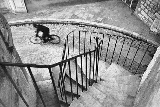
The bicyclist is a third away from the top left corner of the frame; this heightens the feeling that he is racing out of sight, and that he was caught in a moment of escape.

Béguinage
(Willy Ronis)

These nuns appear submissive and sedate, since they are overshadowed by trees that stretch two-thirds of the frame higher than them. The difference between the soft earthiness of the grass and flowers beneath them and the heavenly light of the sky above them provides an interesting contrast.

Conveying a Message Critique

I labeled this photograph "Seductive," because as I took it, Athena was reaching out to me with her paws and exposing her soft belly in a plea to be petted and rubbed. She knows how to act sweet and loving to garner my attention, and that soft but calculating glow in her tilted eyes gives it away. I like the shallow depth of field, but I wish both of her eyes were sharper, and I'd like to dodge them slightly to bring out their brightness and possibly burn the corners of the frame.

Monday, May 2, 2011

Conveying a Message

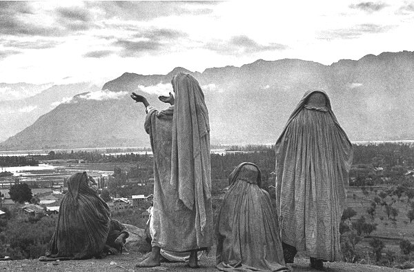
Henri Cartier-Bresson, Srinagar, Kashmir
(Cartier Bresson)

This image stood out to me because of the vastness of space and light unfolding before the people in the scene. Although their backs are to us, much feeling is still conveyed by their posture, a mix of hopefulness and thoughtfulness and passion, and possibly patience.

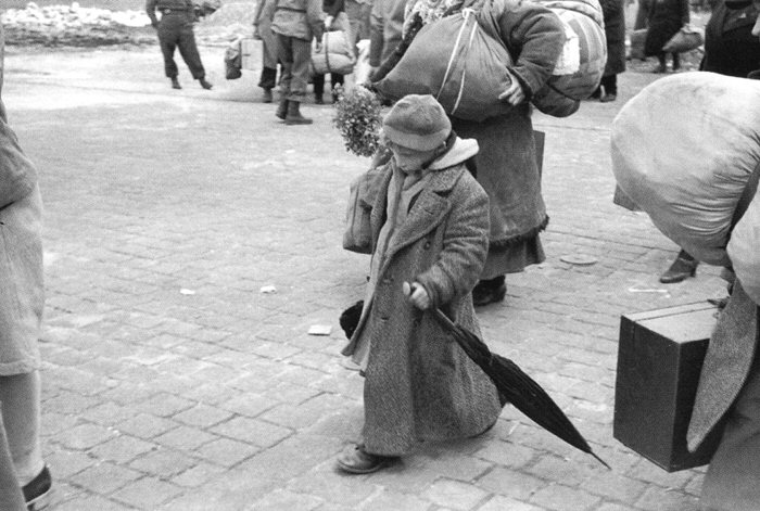
Russian Child Released from Concentration Camp
(Cartier Bresson)

This downcast figure, although surrounded by busy, bustling people, seems so desolate and solitary, so lost in her thoughts; she seems to be concentrating only on forward movement, oblivious to the life around her. I like this photo because it seems to narrow down the focus and capture time in a moment.

River Guide and Cargo during a Violent Thunderstorm, Heath River by Sam Abell at Les Yeux du Monde Gallery
(Sam Abell)

The eerie, glowing blue light and the solitary figure half-eaten by the water turns this photo into something mystic and threatening, cool and watchful. I like the way it draws the eye in because of the burning around the edges.

A Female Sloth and Baby at the Asunta River, Bolivia by Sam Abell at Les Yeux du Monde Gallery
(Sam Abell)

The sloth appears so desperate, and yet so determined, against such a stark landscape. Even the sky has a nearly hostile glow. It reminds me of a man burning with thirst in a desert reaching out for water he only imagines is there.

Pane Trees
(Sam Abell)

These stately, trimmed trees are silent guardians along a deserted road, and the mountains are so faint they almost seem unreal. The entire photograph has a feel of fantasy and fairytales about it, like something straight out of Narnia.

Sunday, March 27, 2011

Jim Brandenburg Movie

My favorite photograph out of all ninety is probably (although it is almost impossible to choose out of so many beautiful and moving photos) the shot of the wolf chasing after the ravens. I love that it is so full of energy; it is charged with a playful, vibrant spirit. This emphasis on the energy of life is elevated by the simplicity of the shapes - the ravens are fuzzy silhouettes, and the wolf is sharper but still softened. Brandenburg used a fast shutter speed to capture the motion of the wolf and ravens, and a slightly wide aperture to make the wolf the center of the focus. The wolf is also about a third from the edge of the frame.

I think he chose to limit himself to one photograph every day because it would force him to appreciate everything. When he could only choose one subject and he had twenty-four hours to find it, he had to look at everything - because what if he took the photo too soon, and then saw the perfect shot moments later? It was a reflective, almost meditative experience. It led him to be more observant and more patient, and more connected with the pace of the natural world.


http://deftony99.files.wordpress.com/2010/02/40_frostgrass1.jpg


http://audubonmagazine.org/features0201/images/F-Brandenburg.jpg


https://blogger.googleusercontent.com/img/b/R29vZ2xl/AVvXsEgrouaeJ7STNmE_ttN4KxaDrRKWXzHKG7GpsnxR2LMmPml_5-mb6RNe2ZxQwc2d3NoguSXriG8b9MdkZ8jOVMvmGK_QXzZmQSE68VKJnZ-dBm0oEzHyLsjmmII9TWOoUHiTaLo4k14PjEt0/s1600/w186fernbergblackwolf.jpg


http://www.bellmuseum.org/images/drawn_brandenburg.jpg

Personal Critique


This is one of my favorite earlier prints - I think the contrast is just about right, and the focus isn't too sharp or too blurry. I like the way everything fades the farther away you get from the bridge. The white paint stands out very boldly, and I think the lines give it just the right shape and direction.


 This photo is certainly full of lines, but it's a little too crowded for my taste. If I were going to take it again, I'd get much closer, focus sharply on the broken tree, and use a shallow depth of field. Then I'd dodge and burn so that the log stood out clearly against the darker background.
http://www.gcollier.com/California-Redwood-Forest.jpg

I found this photo particularly beautiful because of the intersecting lines of the straight trees and the rays of sunshine.


http://www.cattails.info/images/cattails_8yyb.jpg

These cattails are basically a collage of lines, and I think the mix of colors and the contrasting brightness makes them stand out even more.

http://www.wisebread.com/files/fruganomics/u4/save_supermarket.jpg

The rows in this supermarket create interesting diagonal lines, highlighted by the repetitive shapes of the food items.


http://www.wildlife.state.nh.us/Wildlife/Nongame/turtles/Turtle_images/Painted_C_H_Warren-NBII.jpg

This row of turtles is a softer, more natural line, but it still creates a path that the eye is drawn to follow.

http://jeremiah33three.files.wordpress.com/2008/09/spider_web2.jpg

The carefree branched lines of the tree, the geometric lines of the spiderweb, and the indistinct lines in the background allow this image to radiate from its central point in a subtle way.

Personal Critique


I'm glad that the mailbox is the only element of the photograph in sharp focus, but now I wish there was a more interesting and complex background to show more blurring. I think the angle would have been better if I'd moved a bit up and to the right. Also, if I were to print it again, I'd dodge the mailbox a bit to make it less dark and uninviting to the eye.


I like this photograph well enough, but I feel that it lacks creativity and could use some spicing up, perhaps with a slightly different crop and a filter to add contrast. I do like the shadows of the trees falling across the road, and I would want to emphasize them even more. I was pleased with the sharp focus on all layers of the image.

Monday, March 21, 2011

Depth of Field

Shallow Depth of Field


Tabby Kitten - Estimated Aperture: F2.8 This photograph is closely focused on the kitten; the shallow depth of field is primarily due to the closeness of the camera to the subject and the wide aperture.


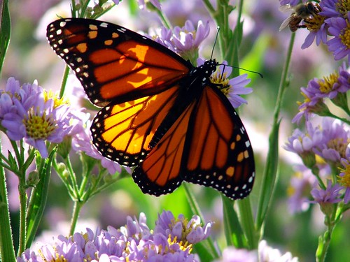
Monarch Butterfly - Estimated Aperture: F2.8 In this image, too, the camera was brought close the the butterfly (note how the focus is sharp on the wings, but even the flowers close by are slightly blurry).

Cats Wallpaper


Kitten and Flowers - Estimated Aperture: F2.8 The camera has been brought fairly close to the kitten, and the sunflowers in the background appear to be some distance away; however, the wide aperture was necessary to remove all detail and turn them into a blur of color.

Far Depth of Field


Valley Landscape - Estimated Aperture: F8 In this photo, the entire scene is sharply focused. All of the elements are distant from the camera, and all are clear and easily separated by the viewer's eye. The smaller aperture lends greater depth to the image.


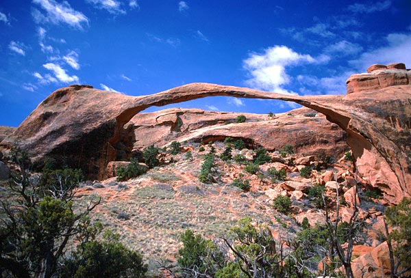
Stone Arch - Estimated Aperture: F11 Here everything from the scrub trees to the stone formation to the clouds are sharp and well defined, the result of a very small aperture.


Blue Ridge Mountains - Estimated Aperture: F11 Like the photograph before it, this shot from the Blue Ridge Mountains captures every layer in almost full detail, all the way to the horizon (the haze there seems to be more humidity than lack of focus).